Inside Belgravia’s newest bistro, object lessons from a Paris-based lighting brand and the case for bringing the human element back to graphic design.
|
Wednesday 1/10/25
|

|
|
London
Paris
Zürich
Milan
Bangkok
Tokyo
Toronto
|
|
|
|

inside story
In this week’s dispatch we’re enjoying the warm-toned atmosphere of Le Café Nac, the new all-day bistro in London’s Belgravia. Then: we meet the magazine-obsessed co-founder of a Paris-based lighting brand, consider the unrealised plans for a cabana-based summer colony in Los Angeles and shine a light on Tate Modern’s late-night bar. Up first, Jessica Bridger makes the case for the human element in graphic design.
|
|
OPINION: Jessica Bridger
Finishing touches
Graphic designer Jim Parkinson was a lettering artist and type specialist who created the now iconic logos for magazines such as Rolling Stone, Newsweek and Esquire. He died earlier this summer at the age of 83. In 1963 he graduated from California College of the Arts with a degree in advertising design and painting. His career took off during the analogue heyday of graphic design, when lettering for logos and logotypes was done by hand – an approach that many fear is being lost.
Today’s desire to use digital tools is understandable. Advances in technology mean that you can now sketch with an ever-improving array of pencils on your tablet – but even these tools need to be turned into zeros and ones in the digital world. In contrast to the warm, hand-drawn feel of Parkinson’s work, graphic identities are now slick, sleek and sit perfectly on a page, in shop windows or on the fenders of cars. The kerning is precise but everything looks the same – the result of computer-led design. This is compounded by the desire for brands and companies to have visual identities that can be presented across different mediums at a variety of scales. There is, as such, a lack of certainty, serendipity and human touch – a loss of “happy accidents” as my Harvard Graduate School of Design professor Holly Getch Clarke called them.
Despite this, there is reason to be optimistic. US restaurant chain Cracker Barrel has long had a logo that only a human could have envisioned: a man in overalls sits on a cane chair and leans on a large wooden barrel next to a large yellow blob emblazoned with the company name in unbalanced, un-kerned lettering. In a bid to correct this, the company carried out part of a $600m (€510m) rebrand in August, removing the overall-clad man from its logo and digitally homogenising the typeface. The following day, Cracker Barrel experienced a $100m (€85m) drop in value. It seems that you can put a price on the use of technology in branding after all.
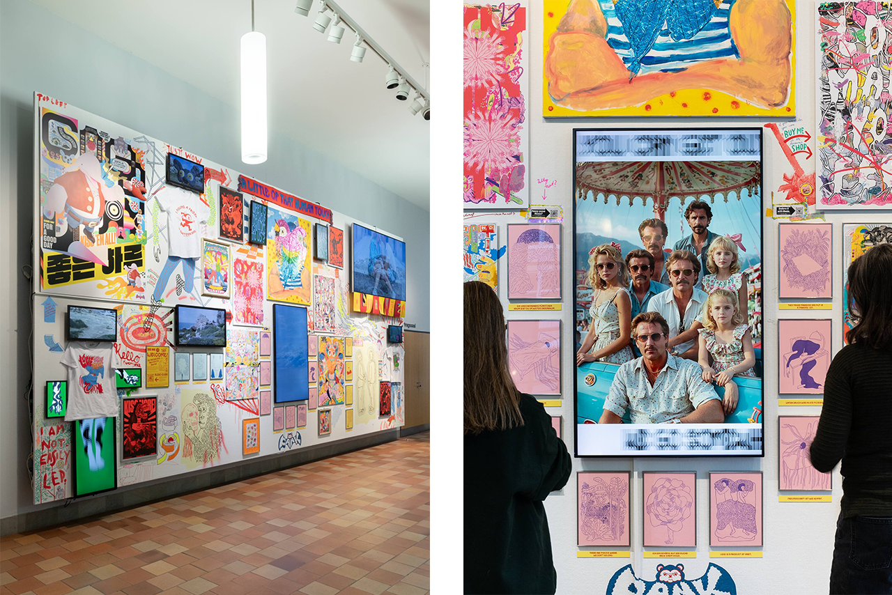
Thankfully, some of today’s creatives are making the case for doing things by hand. Swiss firm Pank, founded by Paula Troxler and Kleon Medugorac, recently exhibited a multimedia installation with digital and analogue elements at Zürich’s Museum für Gestaltung called I Don’t Need Graphic Design, I Need a Little of That Human Touch (pictured). The showcase was an unabashedly human and messy collage that put a finger on what much of contemporary graphic design misses: the human hand. In just the title, they were able to articulate the approach of designers like Parkinson.
Jessica Bridger is a contributing editor at Monocle. For more news and analysis, subscribe today.
|
|
MOBILIER NATIONAL  MONOCLE MONOCLE
|
|
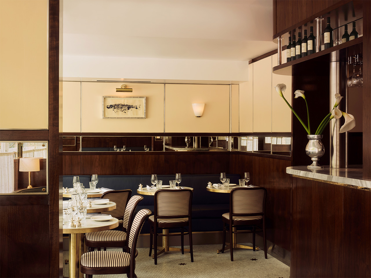
the project: Le Café Nac, UK
Everything in its place
London’s upscale Belgravia neighbourhood has a new all-day bistro. With marble floors, bistro chairs and warm-toned, wood-panelled interiors by New York-based designer Sarita Posada, Le Café Nac is an ode to the old-school European brasserie. “We particularly like the pale tone of the yellow for this location, as it feels fresh during the day and transitions nicely into the evening,” says Colombia-born Posada. “The hope is that you might not be able to immediately place what era you’re in upon entering, and that people will experience Le Café Nac as a place designed to be layered, loved and lived in over time.”
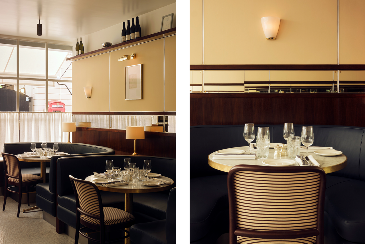
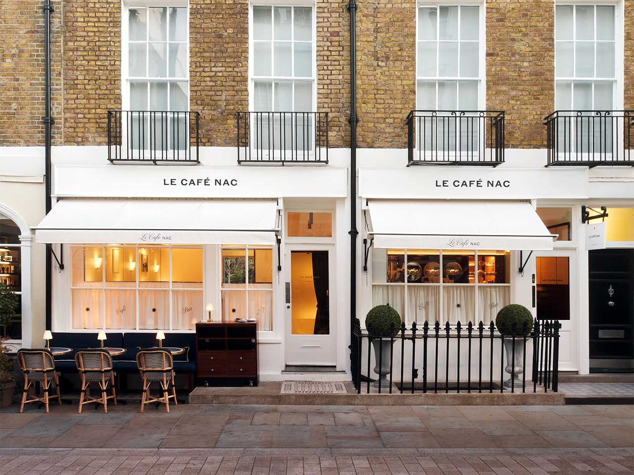
Posada is best known for her work on fashion brand Aimé Leon Dore’s London shop, as well as the sun-soaked Palm Heights Grand Cayman hotel in the Cayman Islands. With Le Café Nac, Posada considered the space’s continuous use throughout the day for drinking and dining. “A bistro, particularly one that serves breakfast, lunch and dinner, has some unique parameters. It must transition between experiences seamlessly while also being robust from a finish standpoint,” she says. “This requires the careful orchestration of both practical and aesthetic elements.”
saritaposada.com; lecafenac.com
|
|
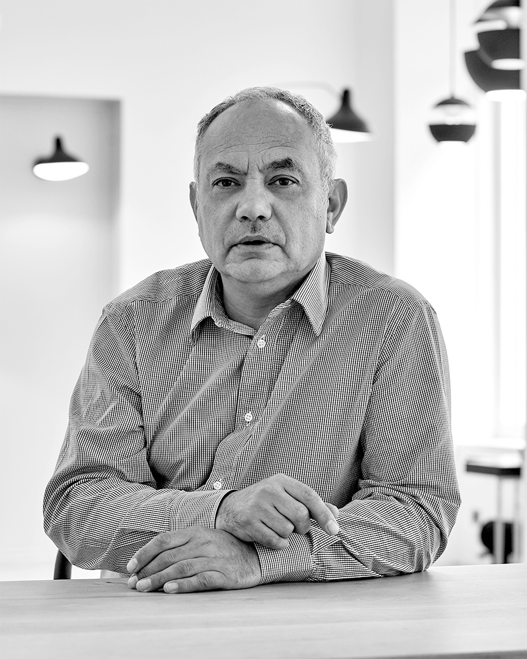
WORDS WITH... Frédéric Winkler
Object lessons
Frédéric Winkler had a career in broadcasting and the media before co-founding DCW Éditions in 2008. The Paris-based lighting brand began by reissuing works by French designer Bernard-Albin Gras and Germany-born UK sculptor Bernard Schottlander, reflecting an appreciation for outstanding mid-century design that prioritised gentle, will-lit environments. Today its catalogue has been expanded to include contemporary models by the likes of French architects Dominique Perrault and Gaëlle Lauriot-Prévost. Here, Winkler discusses the influence of his editorial background on design and explains why you should never buy art from your life partner.
A designer or movement that has influenced you the most?
Magazines have always influenced me. Before I learned to read, I scrutinised and dissected them, looking for decorations, photos and fashion.
What are some of these magazines?
When I was seven years old, I would look at Lui magazine. It featured drawings from French pin-up artist Aslan but it also had a section called ‘La défonce du consommateur’, with crazy, incredible toys for James Bond. Zoom also had a huge influence on me and featured photographers from all over the world. These titles taught me how to travel and touch with my eyes.
A recurring source of inspiration?
Nature, music and landscape.
A favourite project that you’ve worked on?
The one that I’m still working on.
The sky’s the limit: which piece of furniture would you love to own?
Every time I have a piece that I love, a close friend likes it too. So I give it to them. I never search for an object – we meet each other.
Why is sharing your passions important?
This is best illustrated through a story. One day my wife, Ema Pradère, who is a ceramic artist, painted a marvellous mountain in New Zealand. I bought the painting from her in order to make sure that she wouldn’t sell it. However, I returned home and it had disappeared. My wife had sold it. Despite this, I stayed with her in the hope that she would paint another one for me. I learned that owning objects is not the goal – they have to circulate.
What’s a priority for you or the industry going forward?
To open the soul.
Which city has the best design scene?
Flea markets all over the world. Paris is good for this.
For more from leading voices in design, tune in to ‘Monocle on Design’ on Monocle Radio.
|
|
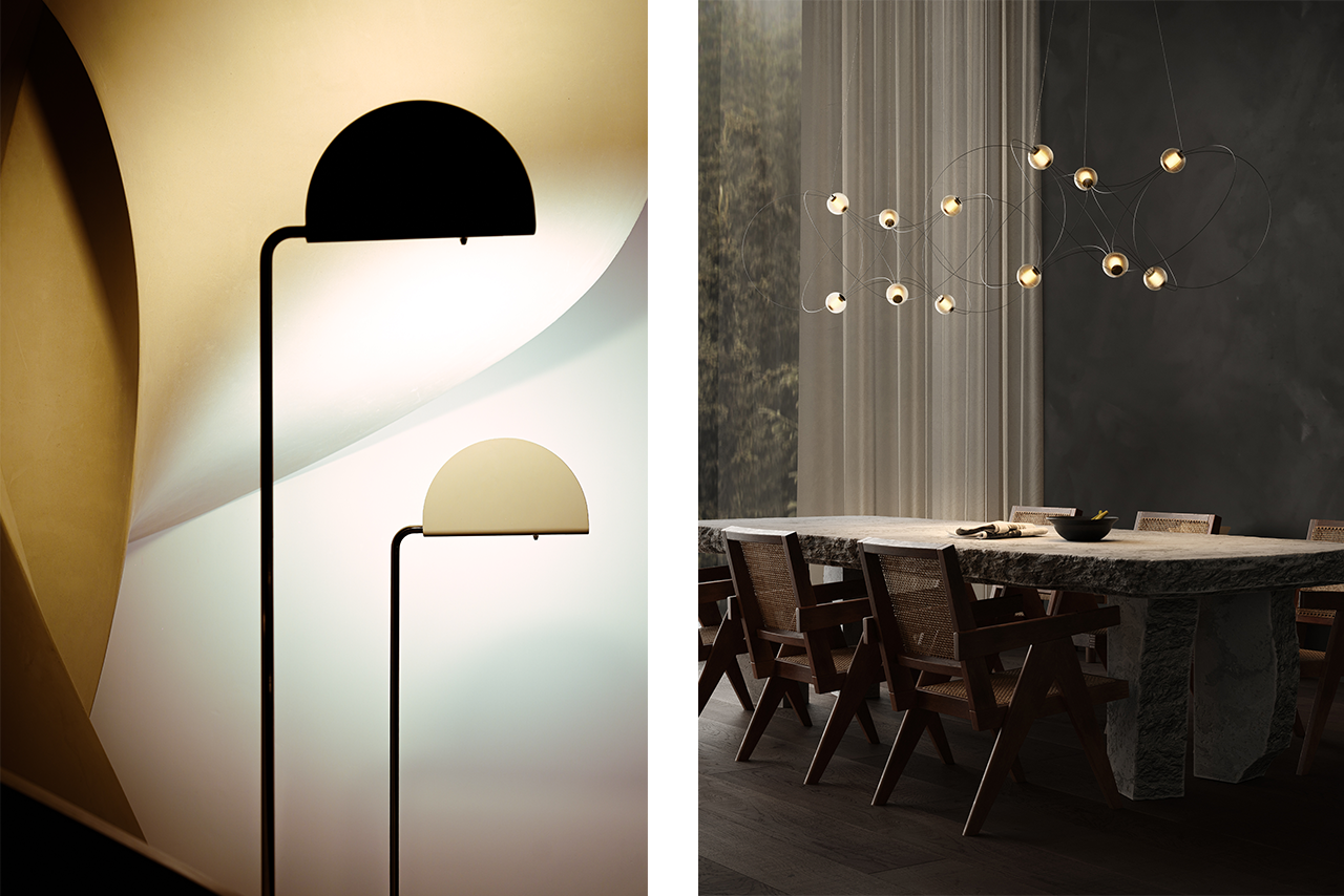
Sponsored by mobilier national
|
|
from the archive: Beach Cabana, US
Cabana club
Those catching some late-season sun would do well to look at the work of architect Rudolph Schindler, who drew up a proposal for a summer colony on the beach in Los Angeles. The Cabania City Project is a hedge-lined compound featuring about 30 small cabanas with space for little more than a bedroom and a kitchen counter inside. They were to be arranged in a semicircle, so that all residents could wake up with an unobstructed view of a modest communal pool and the Pacific Ocean beyond.
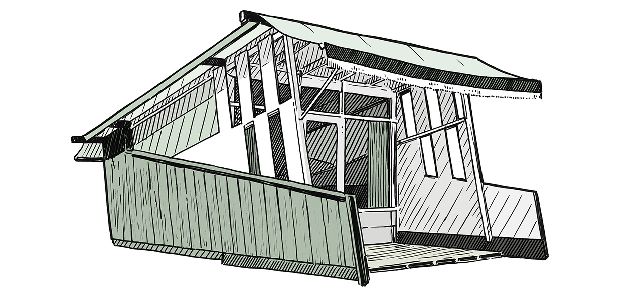
Though there are drawings for the compound in Schindler’s archives, as well as photographs from 1937 of a scaled-down prototype house, the project was never realised (the client couldn’t find a beachfront property at the right price). With summer coming to an end, a sun-seeking developer should rummage in Schindler’s archives and finally realise the designer’s vision. Come next season, Cabania City would doubtless be the hottest place to spend the holidays.
|
|
around the house: Corner Light, UK
Green light
When London-based lighting design studio There’s Light joined forces with Australian brand Neoz to illuminate the Corner bar at Tate Modern, they knew that sustainability would be the driving factor behind their product. “Designers tend to focus on today but we want to see what can happen five years down the line,” says There’s Light creative director Fabio Cristini. The resulting Corner Light is a geometric cordless lamp that’s versatile in its design and entirely demountable (should any part of it need replacing). “Corner bar is different from other commercial spaces because it’s going to be there for the long run, so we wanted to make something special for them.”
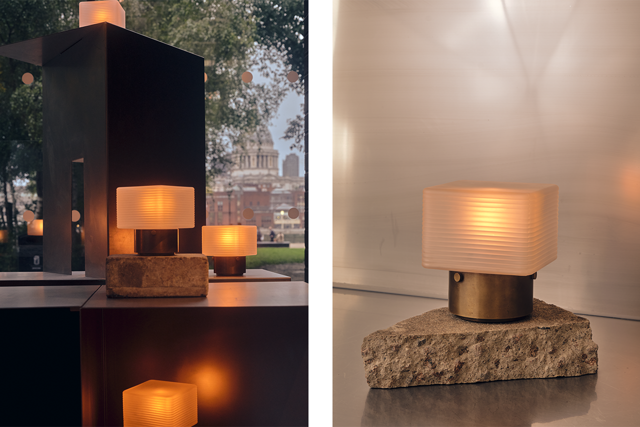
This playful yet ageless product reflects both the palette of Corner bar and the broader elements of the gallery. “The façade of the Tate has these long rectangular windows, a beautiful nod to art deco.” The choice of materials – brass and frosted glass radiates a warm and layered glow – creates the perfect atmosphere for recharging after taking in some world-class art.
thereslight.com; neoz.com
|
|
Monocle Radio: MONOCLE ON DESIGN
New episode: British Ceramics Biennial, October issue preview and Vienna Design Week
We visit the ninth edition of the British Ceramics Biennial and preview the October issue of Monocle. Plus: a stopover at Vienna Design Week.
|
|
| | |