|
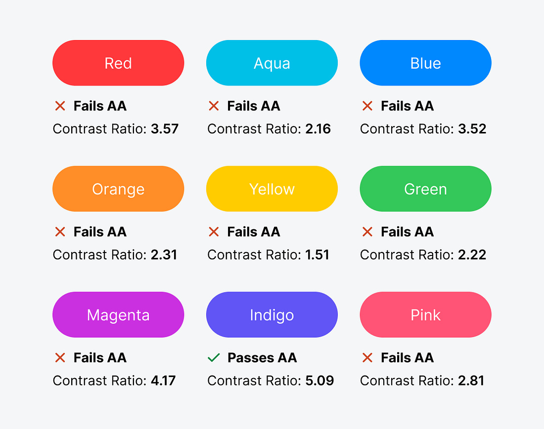
Are you using a bright color on your buttons? You might not know this, but your users could be having trouble reading the text labels. If they have difficulty reading them, they won’t feel comfortable clicking them to complete their tasks.
Brightly colored buttons with white text labels are inaccessible to users with visual impairments. This includes color blindness and low vision, which commonly affects the elderly.
To check your button accessibility, use an online color contrast calculator to calculate the contrast ratio. It needs to be 4.5 or higher to meet the level AA accessibility standard. Unfortunately, most bright button colors fail the test.
 |

Continue reading this post for free in the Substack app
![]()
![]()