|
When designing any interface, one of the first things to consider is the size and spacing of your elements. This can be challenging because there are too many arbitrary values to choose from with no definitive right answer. Nitpicking pixel measurements in search of the perfect size and spacing will slow you down significantly and result in inconsistent designs.
 |
For example, if you’re designing a card, what dimensions should the container be? What should be the width and height of the buttons? After that, what should the margin spacing be between all the elements within the card? Designing without clear constraints leads to decision fatigue and wasted time on minor details.
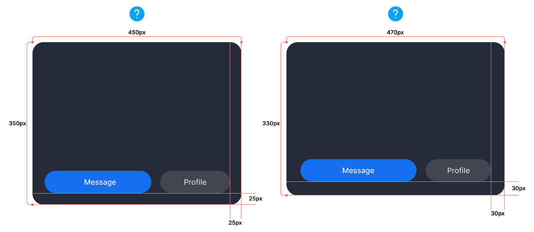
These card containers and buttons have different pixel sizes and spacing. Still, it’s hard to decide which design to go with because they look similar. How do you decide when there are so many arbitrary values and variations available? The answer is to build your own sizing and spacing system.
Building the System
Don’t struggle with arbitrary values when sizing or spacing elements. Instead, limit yourself to a predefined set of options to reduce decision-making time and ensure consistency across all elements and components.
Start with a sensible base value and then build a scale using factors and multiples of that value. A good base value is 12px because it’s a highly composite number with more divisors than any smaller number (1, 2, 3, 4, 6, 12). This makes it a foundational unit for various systems, including time (12 hours in a day/12 months in a year) and measurement (12 inches in a foot and a dozen).
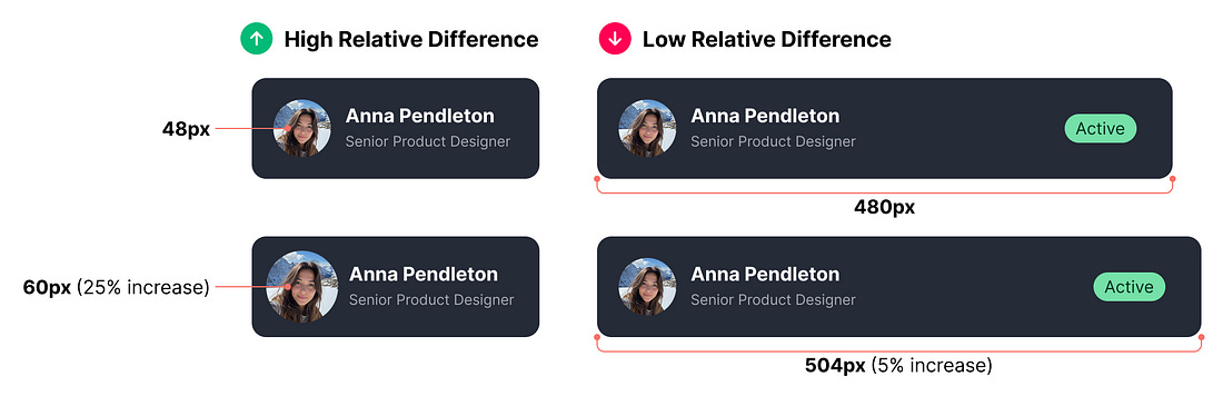 |
It’s not as straightforward as just using multiples of 6 and 12, as there would still be too many options to choose from. For the system to be effective, it must consider the relative differences between adjacent values.
For instance, the relative difference between 48px and 60px avatars is 25%. However, the relative difference between a 480px and a 504px card width is 5%. This means the 5% difference is five times less significant than the increase from 48px to 60px.
In other words, the values at the lower end of the scale should be packed together because they have a high relative difference. On the contrary, those higher up the scale should be more spaced apart because they have a low relative difference. The key is determining how close or far adjacent values should be...
